Views: 95
 By JellyBean Painters
The colours used to decorate rooms in a house can influence our moods and thoughts. Certain colours can brighten our mood or have a pleasant calming affect, while others have been known to create eyestrain, higher blood pressure and/or have a negative influence on mood.
Choosing the right colour for your particular space is more important than you would think.
Choose Wisely
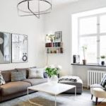
Consider that each colour has a psychological value. Choose your colours wisely to create peace and harmony in your home, the liberal use of certain colours could have an opposite effect on the occupants. What mood would you like to create and which colours will assist to achieve that mood? Colours behave in three basic ways; active, passive and neutral. Light colours make rooms seem larger, more spacious and airy. Dark colours are warm and sophisticated and give large rooms a more comfortable, intimate feeling.
Here is a closer look at what colours can do for a space.
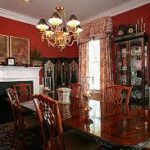 RED: Associated with – courage, strength, energy, masculinity, enthusiasm, warmth and excitement; it motivates us to take action.
Suitable for: dining rooms because it promotes social environments and helps stimulate the appetite.
Negatives: can be aggressive, visual impact, can cause headaches or increased heart rate. (Try softer tones or just an accent wall) Note: red should not be used in a baby’s room
Pink: Associated with – love, affection, femininity and tranquility. Pink is intuitive and insightful; supports comforting feelings. 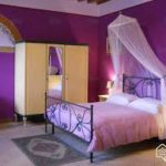
Suitable for: bedrooms as it can be calming and relaxing
Negatives: can be too feminine for some; emasculating. (Adding some dark accents can help with counterbalancing)
 Orange: Associated with – comfort, food, warmth, fun, optimistic and uplifting. Promotes being extroverted and uninhibited. Thought to aid digestion.
Suitable for: Living rooms, Dining rooms or high light areas.
Negatives: can be overstimulating or over-bearing
 Green: Associated with – balance, harmony, nature, peaceful, calmness and stability. The colour of spring, renewal, rebirth; it helps restore depleted energy and our sense of well being.
Suitable for: Living rooms or Bedrooms
Negatives: too much green can be boring or bland (red or orange accents can counteract those feelings)
 Blue: Associated with – relaxation, soothing, promotes intellectual thinking, communication, logic, reflection, loyalty. Considered to be the colour of the mind, can calm the mind and aid concentration. Blue is responsible, reliable and confident.
Suitable for: Bedrooms, Bathrooms, Studies
Negatives: Can be too cold, lack emotion
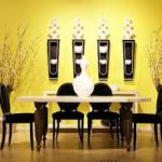 Yellow: Associated with – Emotional, confidence, self-esteem, stimulating creativity, optimism. bright and up lifting. Yellow is cheerful and fun.
Suitable for: Kitchens, Dining rooms or north facing rooms
Negatives: While being a cheerful colour; studies show that babies seem to cry more in yellow rooms and people are more likely to lose their temper in a yellow room, too much yellow can have a negative effect on your mood. Not suitable for bedrooms
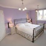 Lilac: Associated with: Spiritual awareness, luxury, truth, quality, feminine, encourages deep contemplation or meditation. Conveys devotion and sincerity.
Suitable for: Bedrooms and Bathrooms to create a stress-free retreat.
Negatives: can be suppressing or introverting
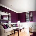 Purple: Associated with – power, wealth, luxury, sex, fertility, conveys wisdom, expands our consciousness, mysterious, death
Suitable for: Bedrooms (accent wall)
Negatives: can be overpowering
 Grey: Associated with – being psychologically neutral, impartial. Livens up near white or silver. Can be versatile and sophisticated if used properly.
Suitable for: Bedrooms, Kitchens, Living rooms
Negatives: Lack of confidence, dreary, lack of energy
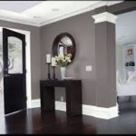
 Brown: Associated with – warmth, nature, being pragmatic, stability. Strong sense of protection, takes responsibility and obligations seriously. Trustworthy, dependable and friendly.
Suitable for: Living rooms, halls, (accent wall)
Negatives: Lack of humour or sophistication
 Black: Associated with – drama, eccentricity, death. Hides emotions and vulnerabilities. It is a non colour and reflects nothing back
Suitable for: use in moderation (accents)
Negatives: depressing, do not use as a base colour
 White: Associated with – cleanliness, sophistication, clarity, sterility, purity, hygiene. Contains an equal balance of all colours and their positive and negative attributes; it is equality at its core. Fair and impartial.
Suitable for: giving small rooms a spacious feeling. Brightening up any room
Negatives: can be too sterile, cold or unfriendly
Written by:
Anthony JellyBean Painters